This is so clever, take one of the old scrap magazines - you know you have a stack just sitting there crying to re-purposed - find an advertisement, tear it out of the book and actually use the magazine page to create your project. What a fun new spin!! Super Love It!
Here's my take on this challenge:

I found my ad in Scrapbooks, Etc. magazine, the ad is for Prima Marketing. Here's how it appeared in the mag:
With my trusty Fiskars micro-tip scissors in hand. Quick work was made with the cutting portion of the show:
After the snipping flurry, this is what I had to work with to design my project.
For the base of the card I chose Paper Studio Kraft Note Cards 5 x 7. Feeling that the background was just too plain, I use a floral mask by Prima (only fitting, since I used their ad to create this card) and applied Ranger Tim Holtz Distress Ink in layers. Starting with my lightest color first and applying with a Inkssentials Ink Blending Tool, I worked in the color around the screen cut outs.
When using a screen or mask, I like to use blue painters tape to hold my work in place.
Here's the look, after one layer of distress ink.
I moved my screen slightly to create a shadow effect. This layer was done in a slightly darker color, Walnut Stain. So you end up getting three colors out of two applications. The original color you applied, plus the second color that shows up in the voids from moving the screen, and a blend of the two shades create a third color.
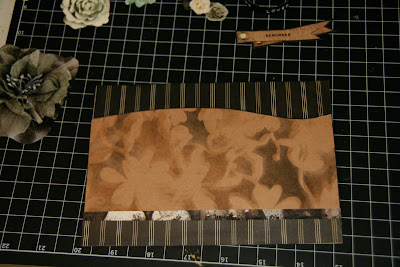
For my final layer of ink, I introduced the color Black Soot Distress Ink. Because a large portion of the magazine images I was using included black, the background needed to tie the black in to the overall design. Moving the screen for each application created a look that almost looks 3-Dimensional. Cool.
The "Remember" tag in the add was so close to the background color, it just disappeared. Using black Bazzill Cardstock, I matted the image to make it stand out.
The overall look needed a little more... Like some Fabulous Basic Grey, Little Black Dress - The New Black, pattered paper, which I found in my handy scrap pile, left over from my Fresh Face layout. I also added a strip of the magazine add layered at the bottom.
The look was completed with the previously cut elements from the magazine ad, plus words punched out on my Label Buddy. Whalla! Great Challenge.
Visit sketches4all


No comments:
Post a Comment