Wednesday, January 25, 2012

Momenta Free Stuff - Don't Miss This Offer

As one of the proud new members of the Momenta D-Lite Team, I want to pass on this special offer to get free goodies to try out. Don't miss out, details posted below. >>>>>> 


Momenta Blog


If you are not familiar with creating your own stickers, take a moment to check this out:


Momenta is offering this amazing Free Offer;

Have you tried our Design Your Own Stickers yet?


You can request a FREE set just by sending your name and postal address to social@mymomenta.com!


(open to US and Canada residents).

Tuesday, January 24, 2012

Technique: Chipboard Shortage, Creative Solutions


Technique: Chipboard Shortage, Creative Solutions

Has this ever happened to you... you are right in the midst of a creative flurry, designing your little heart out. Your photos are rocking and the papers are the perfect hue...all is well and you are are the home stretch of actually completing a layout at the crop event. Alas, you will be able to show a finished work of art to your husband... instead of the typical ... I have this in progress and this and I am going to work on this...yada yada yada

Whoa.... stop to show. Crud! The most amazing chipboard in world, seemingly designed with just your layout in mind...well it seems there are not enough letters to complete the desired tile. Double-crud!

This happened to me recently and I just had to dig deep to "get 'er done". My solution: Use the chipboard outline, where I had previously used the letters and use them as a stencil to fill in the missing letters I needed.

Using a heavier weight pen, I made the letters bold so they would stand out against the patterned paper.


I took my stenciled letters and layered some actual chipboard letters for a unique (and thrifty) application.


To frame the custom title, I used simple strips of cardstock for a bold, defined look. 


Gotta love the 3-D look of this work. Dimension and pop - but possible on a small product budget. And even better maximized use of existing product!


For the final touch, I added some hand written journaling. I am a big believer in using your own hand writing on your scrapbook work. I can tell you that looking at my Grandmothers albums, seeing her hand writing makes them very special. It really does not matter if you have beautiful writing, don't miss the point, your family wants a part of you on that page, telling the story. 


There are some layouts that don't require you to write a deep, insightful novel, just a quick note to go along with the story that the photos are already telling. Sometimes keeping it simple is just fine. 


Keep on creating!

XOXO

~Dionne

Ingredients:
Paper:   Prima Ferrulle
Cardstock:  Bazzill Black
Chipboard:  Scenic Route Capital Hill
Other:  Maya Road Sheers, Prima Floral
Thursday, January 12, 2012

Technique, Reverse Matting, Layout Bliss


Project:    12 x 12 Layout "Bliss"
Designer:  Dionne Marie Smith
Blog:        DionneMarie.Blogspot.com
Photo:      Corinna Hoffman

Ingredients:
Papers:    Bazzill Basics Paper Cardstock, Black
               GCD Studios Donna Salazar Designs, Antiquities
Inks:        Ranger, Tim Holtz Distress Ink, Walnut Stain
Other:     Tim Holtz Grungeboard (used as a template for hand cut letters)

Techniques:
Using my favorite Reverse Matting technique, I placed my photo over the Donna Salazar patterned paper and traced in pencil. Then added a 3/4" trace, leaving the portions of the design out of the trace.
With an exacto knife I cut out the middle of the paper, then inked and out-lined with a second hand cut layer of cardstock.


Tuesday, January 10, 2012

January Challenge @ Sketches4all - check it out

Another wonderful event hosted by Sketches4all. Check out the details here:
http://sketchesforyou.ning.com/forum/topics/sketch-lo-challenge-dt-inspiration-rak-is-6x6-happy-days-echo-par

This is how I incorporated the requirements of this fun challenge:


Create for Sketches4All January Challenge

Title:      The Good Stuff

Designed by Dionne Marie Smith
DionneMarie@blogspot.com

Ingredients:

My Minds Eye, Lost and Found Christmas
Bazzill Small Scallop
Basic Grey Fruit Cake Fibers
Kaiser Craft Clocks overlay
Tim Holtz Idea-ology Fragments
Pigma Micron Archival Ink
Imaginisce Pointsettia Vendetta
Creative Cafe Stamp, Real Life
Wilton Doilies
Tim Holtz Distress Ink, Walnut Stain, Old Paper


Visit sketches4all

Simple Cards - Make Keeping in Touch easy


One of my goals for 2012 is keeping in touch with my friends and loved ones more frequently. Here is a simple card design that is made up of leftover scraps and a few minutes of my spare time. 


Saturday, January 7, 2012

Scrapbook Challenge @ Sketches4all - Magazine Ad Challenge

Check out the creative Jen's January Challenge over at Sketches4All.

This is so clever, take one of the old scrap magazines - you know you have a stack just sitting there crying to re-purposed - find an advertisement, tear it out of the book and actually use the magazine page to create your project. What a fun new spin!! Super Love It!

Here's my take on this challenge:


I found my ad in Scrapbooks, Etc. magazine, the ad is for Prima Marketing. Here's how it appeared in the mag:


With my trusty Fiskars micro-tip scissors in hand. Quick work was made with the cutting portion of the show:


After the snipping flurry, this is what I had to work with to design my project. 


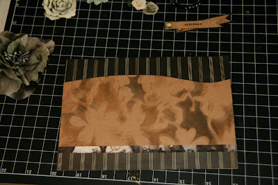
For the base of the card I chose Paper Studio Kraft Note Cards 5 x 7.  Feeling that the background was just too plain, I use a floral mask by Prima (only fitting, since I used their ad to create this card) and applied Ranger Tim Holtz Distress Ink in layers. Starting with my lightest color first and applying with a Inkssentials Ink Blending Tool, I worked in the color around the screen cut outs. 


When using a screen or mask, I like to use blue painters tape to hold my work in place.


Here's the look, after one layer of distress ink.


I moved my screen slightly to create a shadow effect. This layer was done in a slightly darker color, Walnut Stain. So you end up getting three colors out of two applications. The original color you applied, plus the second color that shows up in the voids from moving the screen, and a blend of the two shades create a third color. 


For my final layer of ink, I introduced the color Black Soot Distress Ink. Because a large portion of the magazine images I was using included black, the background needed to tie the black in to the overall design. Moving the screen for each application created a look that almost looks 3-Dimensional. Cool.


The "Remember" tag in the add was so close to the background color, it just disappeared. Using black Bazzill Cardstock, I matted the image to make it stand out.  


The overall look needed a little more... Like some Fabulous Basic Grey, Little Black Dress - The New Black, pattered paper, which I found in my handy scrap pile, left over from my Fresh Face layout. I also added a strip of the magazine add layered at the bottom. 


The look was completed with the previously cut elements from the magazine ad, plus words punched out on my Label Buddy. Whalla! Great Challenge. 


Visit sketches4all

Tuesday, January 3, 2012

New Year - New Altered Design - Nook Case

With Christmas comes new gifts and gadgets. The kids all received Nooks this year, they love to read, so it's a great gift.

Those are expensive little devices and we shopped for cases and ended up with some serious sticker shock. That little adventure inspired me to create a custom Nook cover.  Check it out: